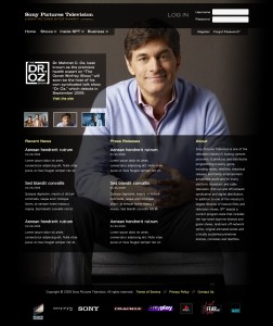
A little while ago, two co-workers and myself were asked to each create some exploratory redesign mock-ups for our business-to-business (B2B) web site SonyPicturesTelevision.com. Unfortunately, things have been put on hold and it is unlikely our designs will ever see the light of day. But that doesn’t mean I can’t share it with you.
The goal was to give the site a much needed face lift while not necessarily adding much more functionality than what was already on the site. We wanted to do as much as possible, while doing as little as possible, if that makes sense.
The site is primarily a B2B site, meant only for other business to use. But, we wanted to appeal to consumers on our non-logged in pages. A small, but professional, party on the outside, and all business on the inside.
Keep in mind these were just exploratory designs and were by no means final.
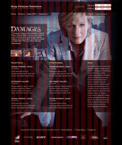
I felt it was important to better showcase our programs so one of my first design decisions was to implement a takeover using artwork from our popular programs (Pay-Per-View movies and TV shows). In terms of priority, I wanted the artwork to be the main focus, along with the title associated to the artwork. Then, I wanted user’s eyes to trail to our “Recent News,” then “Press Releases,” and lastly, “About.” Finally, they should look up to the navigation, where they can find more information about Sony Pictures Television.
I thought it would be difficult to find artwork for our shows that would work well with the way I designed this site, but using layer masks, I found a way to make almost any artwork appear as if it belonged. Note that takeover artwork would change upon clicking the thumbnail of the program, which is located to the left.
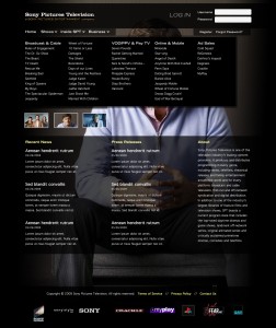
Upon clicking on “Shows” in the navigation, a mega drop-down would show up, listing in an organized manner all of our major and recent programs. Currently, our programs are presented through icons, accessed through scrolling and clicking on different sections. My drop-down solution allows for everything to be shown at once, and thus easy for the user to find what they need.
I created all of my designs, as well as the wireframes I based my designs off of, using a 16 column grid. I find using grids helps to create a balance, as well as a point of reference.


